Anatomy of a set… Mr. Steam
Designing and building a set of the magnitude that was needed for the Mr. Steam set was no easy feat. Imagine a complete bathroom at 15x 35′ no less – design to build in a few weeks time. Then throw in a hurricane to boot!
True we didn’t need a complete plumbing set up but we did need various tricky access’s to allow for camera angles for the video shoot. The ceiling of the shower had to be removable and we needed multiple unobstructed access points for the shower, yet have it remain stable. You can visit https://specificproperty.com.au for more stunning ideas.
A job like this takes team work and everyone worked 110% from the the client to my amazing ( and very pregnant) set builder Nikole Nelson and her team. I also want to give another shout out to Veronika of Modenus. It’s thanks to her and BlogTour London that this project came together in the first place.
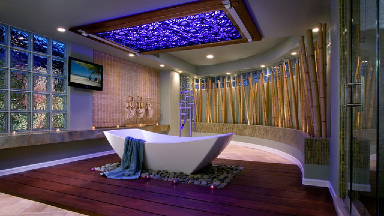
The to die for tub from Victoria and Albert was seen as part of our tour of their showroom while in London, although truth be told it was this handsome guy that sold me on it…I was shocked to find he didn’t come along.

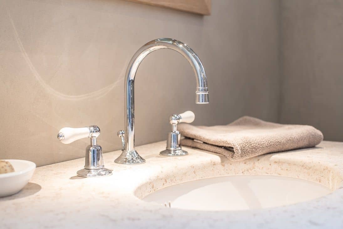
Kevin at Hastings went above and beyond as well helping supply tile, sinks, faucets and shower head, as well as John Veras who braved the treacherous weather driving 12 hours (gas restrictions and all) to personally deliver the pieces we needed. And I don’t think I will soon forget walking through the bleak, hurricane stricken streets of Chelsea to get the crazy beautiful delicate art by Jeri Eisenberg at Kathryn Markel Gallery. The accessory’s from Waterworks added a perfect final touch to make the set feel like a home, from the cozy towels to the delicate glass and porcelain holders.
The major obstacle in this shoot was to create a dream bathroom, yet at the same time remain simple enough that it didn’t overtake the product, which was a fairly small subtle part of the bathroom. In previous sets consumers were confused by what was being sold, focusing more on the bathroom and fixtures, then on the crazy great product. Yet it still had to be luxurious enough that it made everyone race out and buy a Mr. Steam.
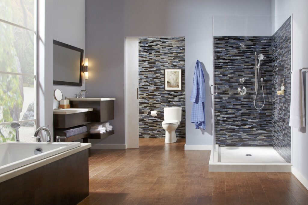
The tile needed to be simple, yet have enough warmth so that it felt inviting. Mixing the white and gray allowed the site to be bright and welcoming yet show off the steam to it’s best advantage inside of the shower. I designed a built in bench running through the shower and back out again which allowed us to shoot both in and out of the shower while giving the models lot’s of lounging area. The artwork was the perfect find as it replicated the scene in the window adding a touch of color and earthiness. All of the fixtures from faucet’s to the drain needed to be elegant enough to fit the space, while remaining sleek and modern to accent the iSteam control. Using a linear drain was the perfect finish as it didn’t break up the sleek tile floor the way a central one would.
In the end the client was extremely happy so it seems the challenge was pulled off.
More to read:
This is when to start your Melbourne real estate agent search
Books – Marrakesh By Design


